Why Is Brooklyn’s Flag So Lame?
If you aren’t familiar, Brooklyn has a flag. And it’s a bummer.
It’s plain white, first of all, with a sort of wonky blue oval shape at the center. Inside the oval is a bored-looking woman in a yellow robe, carrying a fasces, a symbol of unity. The oval is ringed with a motto, in Dutch, Een Draght Maekt Maght (“Unity Makes Strength”), and the words Borough of Brooklyn. It’s… fine. But for a borough that’s increasingly associated with cutting-edge cultural cool, our flag is depressingly square.
The other four boroughs’ flags aren’t exactly stunners, but they’re at least interesting. Here they are, in (what we think is) descending order of visual appeal:
The Bronx
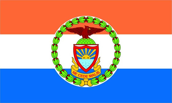

The motto here reads, in Latin, “Yield Not to Evil,” which is badass.
Manhattan
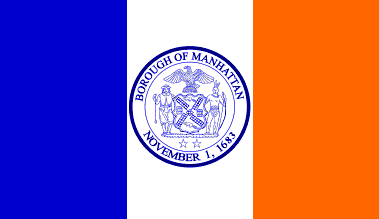

Classic. Very Law & Order.
Queens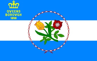

A little unusual, a clip art-y, but the colors are nice.
Staten Island


Adopted in 2002, this flag is the 2002est flag imaginable. I mean, is that Arial? It would be sad, but it’s still better than ours.
Brooklyn


Meh. Just… meh.
Other cities that have Brooklyn’s flag beat include Chicago, San Francisco, Los Angeles, Seattle, Washington, DC, and, oh, Governor’s Island, which isn’t even a borough:
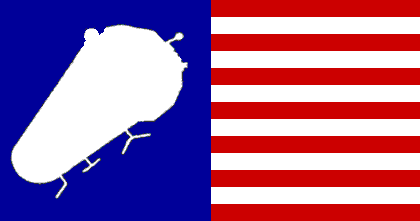

OK, it kind of looks like a weird space bug, but why does it even exist? Governor’s Island is only open four months out of the year!
How did this happen, Brooklyn? Our flag should be tattoo-worthy. It should be on hats and shirts and bags and mugs and college dorm room walls. Can we do something about this?
You might also like 


