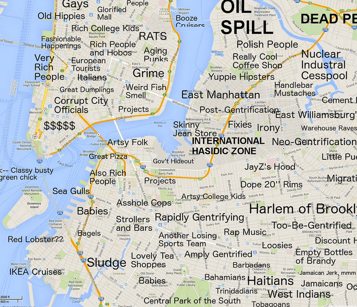
Oh, Look. It’s the Shittiest Map of New York You’ll Ever See
Everyone loves a map, right? I think that’s how the saying goes. Or is that everyone loves a parade? I don’t know and I don’t really care. We’re not here to talk about parades. We’re here to talk about maps. But not just any map. No, we’re here to talk about what’s probably the shittiest map of New York City that you’ll ever see. And I’m assuming you’ve seen the current subway map, so. This is bad.
Via Curbed, we came across this map of New York City which Curbed is pretty sure will “offend just about everybody.” Made by Atlanta-native Joe Larson, who has a blog called Judgmental Maps, this version of New York is probably supposed to be the answer to politically correct bullshit like calling a neighborhood by its actual name. But Larson isn’t going to be contained by your society’s rules. He’s going to label things as they really are. So, Prospect Park? That’s actually the Central Park of the South! (Never mind the fact that Olmsted and Vaux preferred their Brooklyn design to its Manhattan counterpart.) And Bed-Stuy? That’s the Harlem of Brooklyn. (Because, brownstones, sky-rocketing real estate prices and excellent restauarants? Yeah, that was probably Larson’s idea.) And DUMBO is apparently for artsy folk (what, you don’t think the most expensive neighborhood in Brooklyn is solely full of artists instead of tech people or bankers? you don’t know Brooklyn!) while Williamsburg is for people wearing skinny jeans (guess Larson’s never heard of normcore!).
We get what Larson’s trying to do and everything. And it’s shitty enough due to the lack of originality in his jokes (Park Slope has babies? whaaaat??? whennnn???), and the, you know, blatant racism. But what makes it the shittiest map we’ve ever seen is that it isn’t even accurate in its labeling. Because “Another Losing Sports Team”? The Nets had a winning record this year thankyouverymuch. So fuck off with your stupid maps, Larson. Fuck right off.
Follow Kristin Iversen on twitter @kmiversen
You might also like 


