The Poorest Parts of Brooklyn Are…In Williamsburg?
c/o nytimes.com
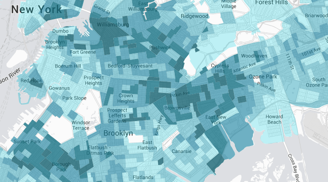
Just when you think you really know a place, you see it all mapped out in tranquil shades of blue and you realize that you didn’t know it at all. Such was my experience anyway when looking at this New York Times map which utilized census numbers to map poverty all across America. Which, America includes New York City, and even Brooklyn.
But while many of the wealthiest areas of Brooklyn were easy enough to guess even without the aid of a map (spoiler: the part of Park Slope bordering Prospect Park West is one of the wealthiest places in the borough) some of the poverty-afflicted districts were a little more surprising. While it makes sense that there are concentrations of poverty in places with an abundance of housing projects, like parts of Red Hook and Flatbush, there is also a preponderance of people living below the poverty line in areas that are among the most expensive to live in the city, places like Williamsburg. Oh sure, it’s not the part of Williamsburg that borders the waterfront or the stretches along Bedford Avenue. No, it’s the southern part of Williamsburg (the part the Times considers “the new frontier”), populated mainly by Hasidic and ultra-Orthodox Jewish families. In fact, the southern part of Williamsburg has poverty rates that climb up to as high as 67.5% of the population, which is higher than anywhere in notoriously poor neighborhoods like Brownsville or East New York. In fact, it’s a higher rate than anywhere other than the area of Brooklyn that contains the Ebbets Field Apartments housing project.
Besides just southern Williamsburg, other areas that don’t fare too well in this census include Borough Park and Crown Heights, both of which average about 40% poverty rates. Notable here is that both of those neighborhoods also have big populations of very religious Jewish families, which tend to be very large, meaning that not only is the percentage of the population that lives in poverty higher than in most of the borough, but also that the actual number of people living in poverty is much bigger than it is in other, less populous parts of Brooklyn. Maps like this (and, of course, the data used to construct them) are instrumental in understanding the income inequality trends in the city so that the necessary programs can be implemented in the communities that need it most. And also so that the preconceived notions that many of us might have about where wealth is concentrated can be vanquished in place of actual knowledge about the place we all call home. This is actually important, I think, in understanding the still existing diversity in this borough, especially if we have any wish to preserve it before a map like this loses all the different shades of blue and becomes an even starker case of haves and have-nots.
Follow Kristin Iversen on twitter @kmiversen