NYPD Releases Surprising Map of the Most Crime Ridden Neighborhoods In New York
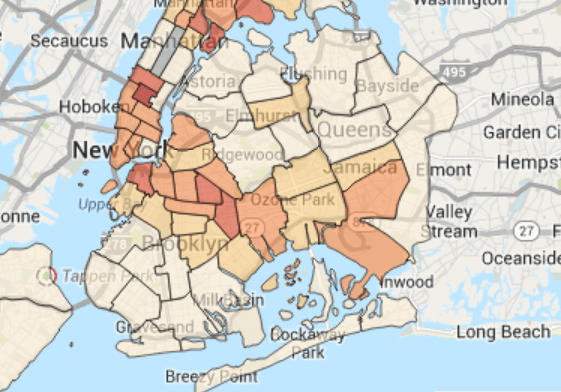
c/o maps.nyc.gov
Maps. They’re everywhere. And usually, they serve to prove the things that we already know, or, at least, the things that we think we know. And so then we really know these things. Because they’re on a map. And maps tell the truth. We think. We think we know that. But so, crime. Where is it happening in New York? You think you know, right? But do you really know? You have no idea.
This map was released based on data compiled by the NYPD, and it shows not only where violent crimes (murder, rape, robbery, felony assault, burglary, grand larceny and grand larceny auto) occur (the NYPD is not in the business of tracking misdemeanors with this level of detail), but also what time of day and month they are most likely to happen, so that criminal trends are easier to follow. What’s interesting about this data is that violent crime actually seems to be quite concentrated, and not always in the areas you’d expect. Sure, as the Daily News points out, crime is most likely to occur in neighborhoods that are poverty stricken, but large swaths of Brooklyn that would not be numbered among the more gentrified neighborhoods in the borough have incredibly low crime rates. This is, of course, a reflection of the still dropping crime rate, as outgoing Police Commissioner Ray Kelly says, “With unprecedented population levels, New York City is safer than ever, with homicides on pace this year to fall below recent historic low.” Kelly continued, “This administration has relied on data to drive its crimefighting, and this map helps enhance New Yorkers’ and researchers’ understanding of where felony and violent crime persists.”
In fact, the development of this map was actually a government initiative that was “was mandated by city law earlier this year and created by the city’s Department of Information Technology and Telecommunications.” Go, city government! Because, really, knowledge is power. And it’s hard not to feel a little powerful, surveying all the crime stats and getting a block-by-block rundown of what was happening on any given day in any part of the city in the last year. There’s been so much talk (both serious and facetious) about what will happen when de Blasio takes over for Bloomberg, and how the crime rate might start climbing again. But looking at this map and these statistics is reassuring. The numbers don’t lie. They might not tell the whole story, but they don’t lie. Crime is still declining. And as long as the creation of this map is still mandated by the government, we’ll be able to get easy access to the statistics that will help us see just how safe this city really is. What can we say? We love a good map.
Follow Kristin Iversen on twitter @kmiversen