BK 50
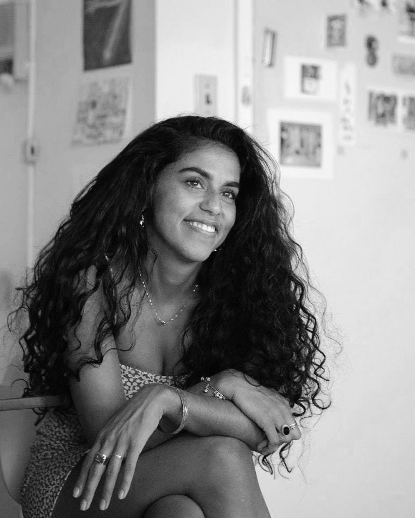
MONA CHALABI
Data journalist
Jul 13, 2021
Odds are pretty good you’ve seen a piece of Mona Chalabi’s data journalism without realizing she was the one behind it (and odds are pretty good she could create a compelling infographic about the odds you’ve seen her work without realizing it).
If your eyes glaze over at the words “data journalism” maybe that’s because it’s been done one way for so long: with a stupefying array of numbers. As the data editor for the Guardian US, Chalabi de-stupifies numbers through charming hand-drawn charts and graphics about some of the day’s most vexing issues. And she does so in ways that are simple to understand—but not simplistic. She tackles Middle East conflict, Covid vaccination rates, police brutality, violence against women, income disparity and more, often with a progressive or activist bent. The results are easily digestible images that contextualize numbers (statistics, money spent, people killed) while humanizing abstract problems. They’ve been shared millions times on her personal Instagram account.
Her work “100 New Yorkers,” which was on display at The Westfield World Trade Center site late last year, distilled census data to visualize what the city’s population would look like if it were presented as 100 distinct individuals—and to show how the effects of the pandemic varied as a result of inequities baked into the city’s infrastructure (e.g., 19 of the 100 are impoverished; 17 live in overcrowded housing).
Chalabi, who is of Iraqi descent, was born in London and is also a writer whose work has appeared in The New Yorker, The New York Times, The New York Review of Books, New York Magazine and more. She has also written for radio and TV, including Netflix (“The Fix”), BBC (“Is Britain Racist?” and Radio 4) and National Geographic (“StarTalk”).