Even New Technology Looks Super Old: Skeuomorphs and You
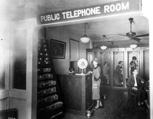

This morning, The Verge ran a short post on the use of speech bubbles in the icons of messaging apps. It was called “Can we stop using speech bubbles for messaging?” and the jury is out on the answer. One thing that seems clear is that the apps’ use of speech bubbles is not for lack of imagination, but for clarity of purpose—speech bubble means talking, and now we talk (primarily, I think) through text. The symbol for telephone is just as universal, but represents an object so dated I had to google it. (It is called a “handset,” or a “transceiver,” which must have sounded futuristic in the 1930s.)
A design element of a new technology that mimics an older technology is called a “skeuomorph,” which is a great word to pull out at cocktail parties (depending on your audience). Once you start looking for them, they’re everywhere, particularly in newer technology.
In the realm of the smartphone, using my iPhone as source material, we find: the phone app, with pictured “handset,” by far the least-used function of what we still call a “phone”; the “Old Phone” ringtone, which was originally the mechanical noise of a hammer and two bells; Notes, or any other notepad-type app designed to look like an actual paper notepad; Google Docs, the icon for which is a piece of paper; the Newsstand app, which mimics a bookshelf; likewise any e-reader app with page-turning graphics, or even page numbers, really; the camera shutter noise, which has no mechanical source in a digital phone camera; the Instagram logo, as well as the camera pictured on the camera app; the analog clock icon for the completely digital Clock app, which elsewhere displays the time in a digital format; the address book, Contacts, which looks like an actual book of addresses; and the Mail app, for email, which shows a paper envelope.
And those are just the basics. On the computer side, at least for Macs, there’s word processing programs, which display text on what looks like a piece of white paper; Stickies, a program of digital sticky notes; a calendar app, which looks like a page-a-day tear-off calendar; and even Settings, which has an icon of interlocking gears, as if this or any other computer has gears—but then what would a motherboard icon even look like?
It’s interesting to observe where different technologies stick in terms of visual shorthand, and it seems related to the state of the technology at the time of a significant change. For instance, the phone app icon is not represented by a candlestick telephone, and only rarely by a rotary telephone, since most landline phones had big, plastic handsets and a “touch tone” keypad by the time cell phones came around. A generic camera function is represented by a fairly simple 35mm, rather than by an old-fashioned tripod contraption with accordion bellows.
Few text-messaging apps involve actual vocal speech, but our speech is mediated by so much technology that the distinction is often lost. I recall texted conversations as vividly as conversations I have in person or over the phone, and it sort of feels like speech. Or, at least, I don’t usually bother to clarify whether someone actually physically said something or wrote it to me as a text. That may be a larger problem, socially, but it’s the everyday reality we’re stuck with.
What is the future of the skeuomorph? Increasingly, in apps like Facebook, Twitter, and Skype, mobile phone usage is indicated with a small, dark rectangle, with a single white dot on it, in imitation of an iPhone. Whatever may be strange or wrong about using speech bubbles used to indicate text messaging, it must be even stranger and wrong-er that “small dark rectangle with white dot” now means “iPhone.”
Follow John Sherman on Twitter @_john_sherman.
You might also like 


