The Depressing Climate of Brooklyn Homeownership, Mapped
Owning a home in New York City might as well be the stuff of fairy tales for most of us. Even though job creation has rebounded significantly since the greatest depths of the recent recession, homeownership in the United States is at its lowest point since 1967. No city drives this statistic home further than New York, where citywide homeownership stands at 32.5 percent. And just in case we needed especially stark verification of this, a new interactive map that depicts owner/renter ratios in America’s biggest cities shows that the economic wounds created by the housing crisis haven’t yet healed. Not surprised? Neither are we.
New York Times journalist Ken Schwencke created “Where Renters Are” using data culled from an American Community Survey compiled in 2013, and the map paints a glaring picture of how prominent rentals are in the American housing landscape, especially in dense urban areas. You’ll see by looking at the map of Brooklyn below that rental units (red dots) dominate the borough, and while just a sliver of apartments are actually occupied by owners (blue dots). According to New York City’s Housing and Verification Survey, compiled in 2014, Brooklyn homeownership stands at 29 percent, which is a measly figure when paired with the national average of 63 percent.
The map isn’t particularly surprising, given the same dialogue about price gauging and rent surging and the increasingly unaffordable nature of Brooklyn, but a bird’s eye view of the issue is a telling—if not disconcerting—reminder that if you want to buy a home, leaving New York City is probably your best option.
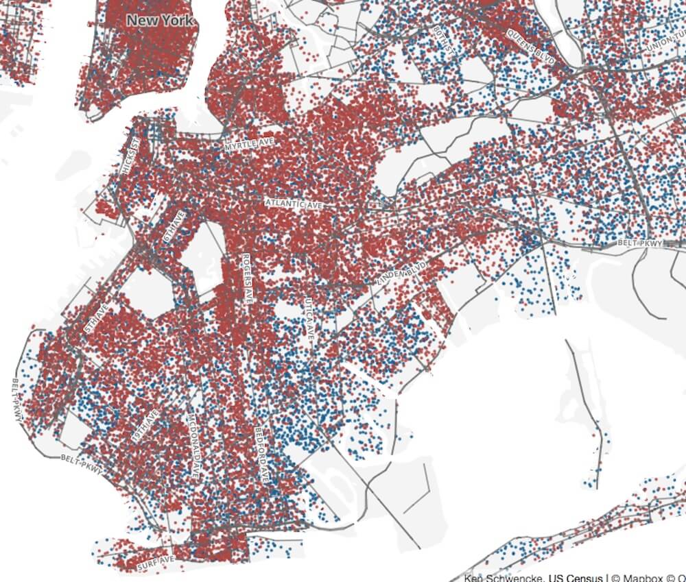
Photo: http://schwanksta.com
Follow Sam Blum on Twitter @Blumnessmonster
[HT Brownstoner]